Other experience [47]
Here's a snapshot of more successful branding, campaigns and other projects
Other experience [47]
Arts & Culture

National Symphony Orchestra
Brand development and campaign for The National Symphony Orchestra (NSO), one of the most successful and exciting privately owned orchestras in the UK.

English Heritage
Promotions and campaigns for English Heritage, communicating their values of authenticity, quality, imagination, responsibility and fun, to raise awareness of the brand and increase membership and engagement.

Royal Mail
The Royal Wedding celebrations symbolized a new beginning for Britain after World War II. Seventy years later, we designed the commemorative stamps to celebrate and reflect.
Bath Artists’ Studios
The home of over 50 individual artists’ studios, the largest collective in Bath, this rebrand helped them reach out to the community in Bath and further afield to promote their space for making, networking and developing creative opportunities.

The Holburne Museum
Promotional communications and campaigns for the Holburne Museum, Bath's first public art gallery, to communicate the new and permanent exhibitions, helping to increase visitors.
West of England Design Forum
Award-winning rebrand, resulting in a 30% increase in membership, for West of England Design Forum, a place for designers, and those interested in design, to come together, share ideas, be inspired and get connected.
Education

Bath Spa University
Working together for over 18 years to design and produce recruitment material for this leading university to cut-through the noise in a very crowded market.

QEH
Brand development, website promotional material and recruitment campaigns for independent school QEH, based in Bristol, resulting in doubling of attendees at a recent open event.

King Edward’s School
Brand development and implementation programme for King Edward’s School, Bath – set up in 1552 by royal charter – bringing greater consistency across all applications, with an identity that reflects the personality and aims of the school.
Engineering & Technology

Dyson
Publication design for Dyson, the British technology company, to communicate their stance on sustainability and set out the challenges of ‘sustainable engineering’ for businesses, engineers, politicians and their customers.

Lotus Scalpels
Lotus had a world beating product – the world’s only torsional ultrasonic scalpel for use in keyhole surgery – but needed a brand to compete in a multinational marketplace and more effective communication to sell the technology. The rebrand resulted in numerous design awards and entry into five new markets.

Viper Subsea
Brand strategy, identity, website and promotional communications for engineering and technology firm, resulting in a 49% increase in revenue.

Brimstone
Stability, durability and Britishness was at the core of this new brand name and identity for a potentially game-changing product for British wood as a more viable timber choice in building and construction projects.

Kaze
Brand strategy, identity, illustrations, animations and website for Kaze, a consultancy providing advice and solutions that enable leaders to make critical decisions with confidence, through a unique combination of digital expertise and decision engineering.

Marlin
Naming, brand strategy, identity and guidelines for Marlin Communications – an independent, leading provider of business communications and technology solutions, to reflect organisational changes and stand out in a highly competitive market.

Fast
Rebrand for this global technology firm – Fast, a world leader in enterprise search solutions. It was sold to Microsoft for $1.2bn two years after the rebrand and won nine design awards.

OMNIE
Brand development, key messaging, print & digital communications and campaigns for Omnie, a leading manufacturer of indoor environment products, to drive brand awareness and strengthen market position.

Whisper Controls
Brand identity for Whisper, a new, specialist, nationwide B2B distributor of domestic heating and cooling electronic and electric controls, with a particular focus on smart home heating controls.
Legal

Abel & Imray
Rebrand and implementation programme for this intellectual property firm, resulting in a 39% increase in visitors to the website and providing a platform for growth to attract new staff and clients.

Trethowans
A leading law firm needed a rebrand to help bring them together and move them forward. After close collaboration with their marketing team and leading partners they’ve now got the tools they need to build their reputation for both personal and commercial clients.

Rawlison Butler
Brand strategy, identity, website and full implementation programme for this a national law firm, resulting in a 52% increase in time spent on the website.

UKELA
A rebrand and flexible design system for the UK Environmental Law Association, who for over 30 years have worked together towards better environmental law.

Sharp Family Law
Brand strategy, identity, website, art direction and promotional communications for this family law firm.

Wilsons Law
Brand strategy, identity and full implementation programme for national law firm Wilsons, bringing through their 300 year history into a distinctive design system.
Non-profit & Government
National Trust
Strategic communication design development and guidelines plus other internal communications for the National Trust.

NHS
Brand strategy, identity and guidelines for the NHS Bath and North East Somerset Clinical Commissioning Group (NHS BaNES CCG) who coordinate the delivery of health services for everyone living in BaNES.
Malvern Hills Trust
Naming and rebrand to help promote this conservation charity that has been caring for the Malvern Hills since 1884 but lacked a strong and consistently recognisable brand. The rebrand helped to increase public awareness of our charity and raise public support.

Commission for Rural Communities
The CRC was set up to provide advice to the government to ensure policies reflect the real needs of people in rural England, particularly the disadvantaged. They needed an identity to establish the organisation and clearly communicate their aims and objectives.

Environment Agency
Over 80 projects covering all forms of corporate and promotional communications, from annual reports, strategy documents and environmental reports to magazines and a national Fish Guide featuring over 300 fish species, with a waterproof cover made out of recycled tyres.
Creative Bath
Brand strategy and identity for an organisation championing and celebrating creativity, through networking, awards and collaboration.
Professional Services

Achieve Breakthrough
Rebrand, website and implementation programme for this organisation and people development company, working with companies around the world to help them grow, transform and thrive.

KPMG
Working together for over 10 years, delivering more than 200 communications and promotional projects for KPMG, one of the big four professional services firms, including many thought-leadership pieces and regular magazine publications.

Wealth Horizon
Branding and implementation for start-up Wealth Horizon, in collaboration with 3Sixty and Valuable Content, resulting in 13,000 website hits in the first few months and winning Transform and Brand Impact design awards.

Design Rally
Brand identity, website and a set of materials that show the range of knowledge and tools available for an independent design management consultant working with both businesses and design agencies.

Candid
A new name, brand and approach for this ambitious finance marketing company. In a shifting market E-finity Leads acquired an innovative company with a suite of digital brands – they needed a brand that would fit.

Crew & Concierge
We conveyed a new level of luxury for this super yacht service that repositioned the whole offer to better connect with the decision makers. Our brand refresh changed perceptions and raised the company’s profile.
Travel & Leisure

Time Out
Redesign of internationally renowned travel guides for Time Out, helping make the guides more user-friendly and visitor-focused and bringing them in line with recent brand developments.

No.15
Naming, brand identity and campaign, centred around ‘Luxury for the curious’, for No.15 Great Pulteney – an elegant new townhouse hotel located on one of the grandest streets in Bath.

The Halcyon
Brand identity and implementation for a new hotel looking to stand out, resulting in a 92% occupancy in the first 3 months, with all bookings based on the branding and website only as there was no hotel photography available prior to the opening.

Footprint Handbooks
Branding, campaigns and editorial design for this travel guide company, resulting in a 25% increase in sales and a DBA design effectiveness award.
Hiding Space
Naming, brand identity, website and marketing campaigns for this new serviced apartments company with a collection of stylish, high-quality, serviced apartments.

Premier Inn
Brand identity development, guidelines and art direction for the UK's largest hotel brand.
Retail
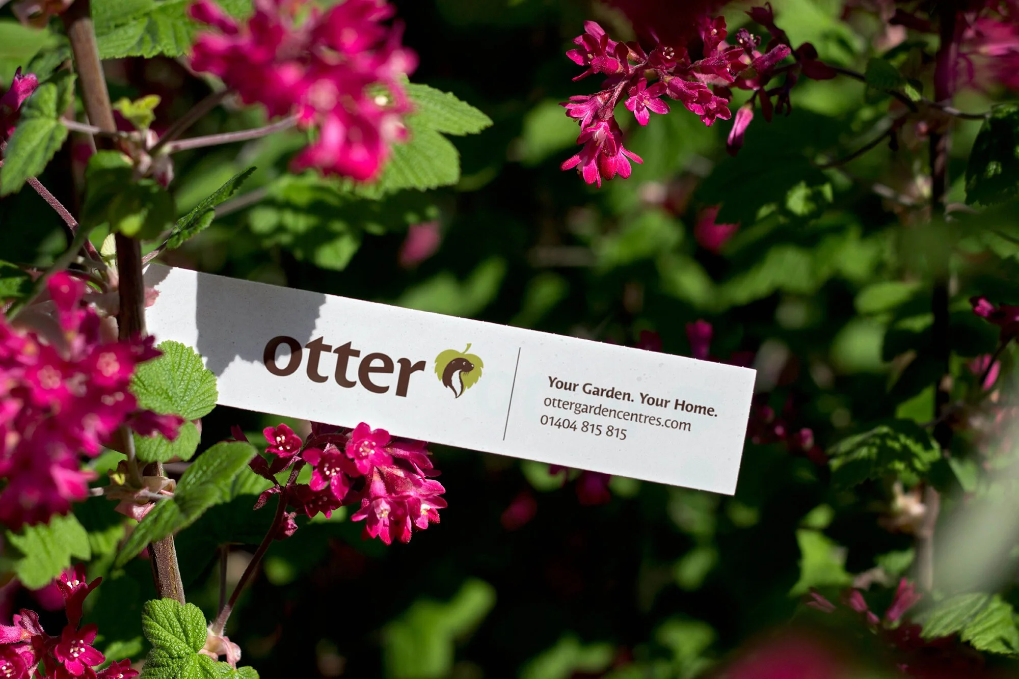
Otter Garden Centres
Rebrand, comprehensive identity guidelines and design system for Otter Garden Centres, to build on the history and provide the foundations for the future.

Milsom Place
A refreshed brand identity and promotional campaigns for Milsom Place, a hidden oasis in the heart of Bath, to help shift perceptions, increase footfall and attract great brands.

Hitch Mylius
Award-winning campaign and promotional work for this contemporary furniture brand, reflecting the strong design approach and craftsmanship.

Nathan
Rebrand, design system and wide range of promotional material for national furniture brand Nathan.

Pirongs
Simple, stylish and playful brand development and implementation programme for Pirong’s, the UK's no.1 retailer of academic diaries.

Root & Branch
Based in Vietnam, Square Roots produces British designed, solid oak dining furniture for the worldwide retail market. As it was expanding the business needed to refine and upgrade their brand message of hand-made quality to achieve sales targets in new stores.

Want more?