Electric Bear
Electric Bear

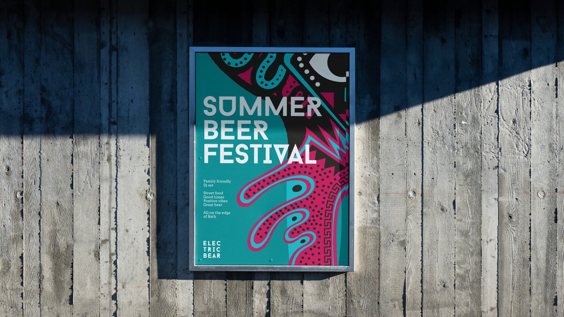
The craft beer world is full of eclectic flavours, unusual names and experimental artwork. But it can be hard to stand out when so much is happening. Electric Bear needed a brand that would be instantly recognisable on everything from their beer pumps, cans and vans to their DJ listings, website and social channels.
Electric Bear has undergone some changes over the past few years, and with a new owner in place, they were looking to grow. We worked closely with their incredibly passionate team to create a fitting brand that would appeal to a broader market without alienating the core audience.
While the ethos of the company is all about making the best beer possible, the tap room’s relaxed industrial setting, street food and DJs provide a creative, irreverent alternative to Bath’s typical perceptions. The line ‘Brewed on the Edge of Bath’ helped communicate their spirit and their location. A distinctive visual identity helped to capture their character and ensured that the team had everything they needed to keep the material consistent and instantly recognisable.
Industry
Food & Beverage
What we did
Brand Strategy
Messaging
Brand Identity
Packaging Design
Brand Guidelines


“We absolutely love our new branding! We have put in some long hours bringing this to fruition but it has been worth every minute - we are so, so happy with the results and the feedback has been great so far.”
Libby Baggett, Operations & Marketing Manager
“We absolutely love our new branding! We have put in some long hours bringing this to fruition but it has been worth every minute - we are so, so happy with the results and the feedback has been great so far.”
Libby Baggett,
Operations & Marketing Manager


Collaborators
The Electric Bear team, Illustration by Sam Hadley
Looking to transform your business?
Looking to transform
your business?
More case studies
Brand Identity,
Campaign,
Print,
Livery,
Recruitment Comms,
Packaging,
Signage,
Brand Guidelines,
Brand Identity, Campaign, Print, Livery, Recruitment Comms, Packaging, Signage, Brand Guidelines,

Naming,
Strategy,
Brand Identity,
Art Direction,
Website,
Print,
Advertising,
Naming, Strategy, Brand Identity, Art Direction, Website, Print, Advertising,
Naming,
Brand Identity,
Messaging,
Print,
Digital,
Naming, Brand Identity, Messaging, Print, Digital,
More case studies
Brand Identity,
Campaign,
Print,
Livery,
Recruitment Comms,
Packaging,
Signage,
Brand Guidelines,
Brand Identity, Campaign, Print, Livery, Recruitment Comms, Packaging, Signage, Brand Guidelines,
Naming,
Strategy,
Brand Identity,
Art Direction,
Website,
Print,
Advertising,
Naming, Strategy, Brand Identity, Art Direction, Website, Print, Advertising,
Naming,
Brand Identity,
Messaging,
Print,
Digital,
Naming, Brand Identity, Messaging, Print, Digital,
Other experience

West African Nuts Direct
We worked with the founder to establish a brand that would appeal to ethical businesses. That would clearly lay down the difference and explain the impact they can make by doing it properly.

Brimstone
Stability, durability and Britishness was at the core of this new brand name and identity for a potentially game-changing product for British wood as a more viable timber choice in building and construction projects.

Clayton’s Kitchen
Brand identity and implementation for Clayton’s Kitchen – the culinary home to Michelin-starred chef Rob Clayton.
Other experience
West African Nuts Direct
We worked with the founder to establish a brand that would appeal to ethical businesses. That would clearly lay down the difference and explain the impact they can make by doing it properly.
Brimstone
Stability, durability and Britishness was at the core of this new brand name and identity for a potentially game-changing product for British wood as a more viable timber choice in building and construction projects.
Clayton’s Kitchen
Brand identity and implementation for Clayton’s Kitchen – the culinary home to Michelin-starred chef Rob Clayton.